Rugged. Refined. Ready.
BRANDING
WEB DESIGN
MARKETING
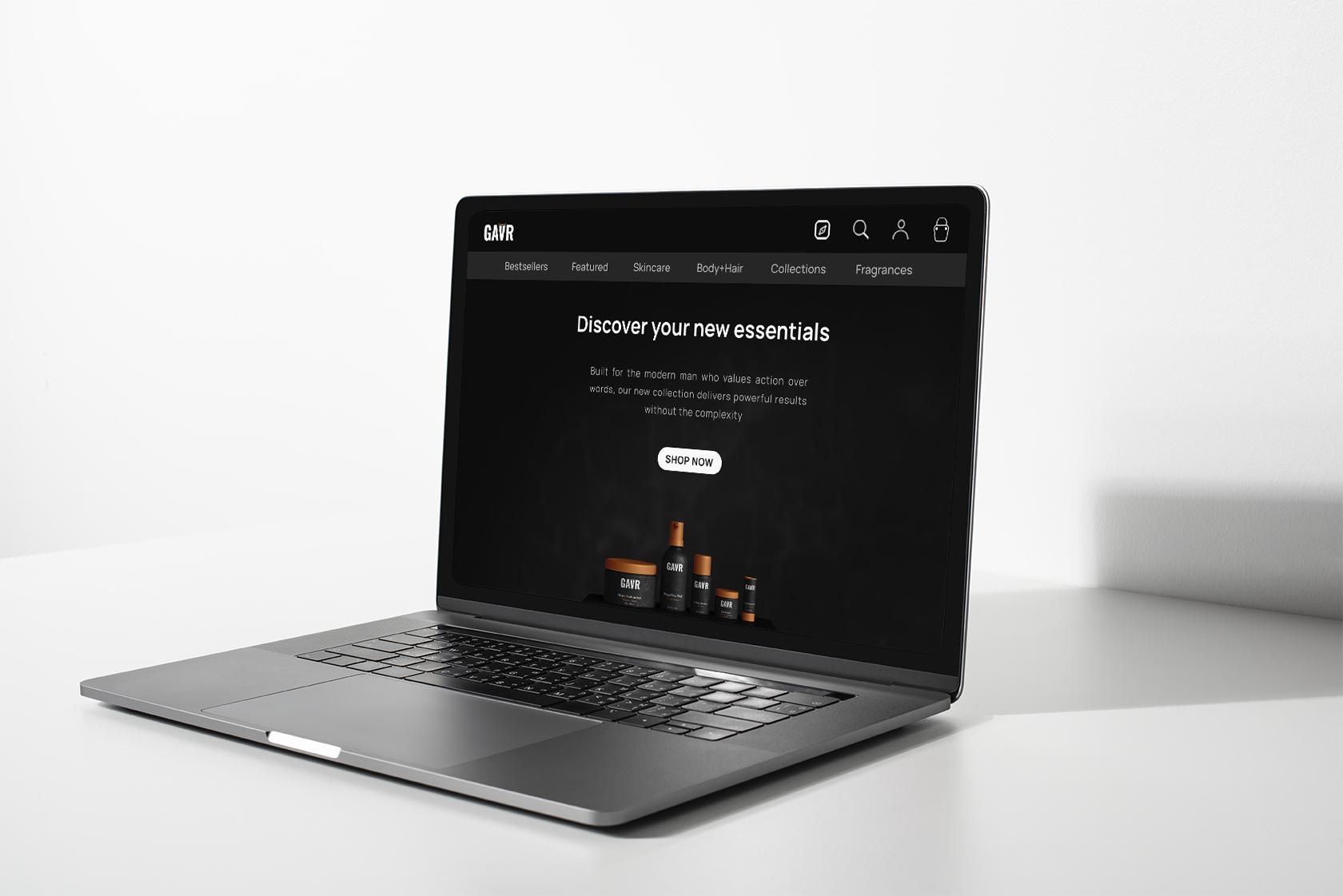
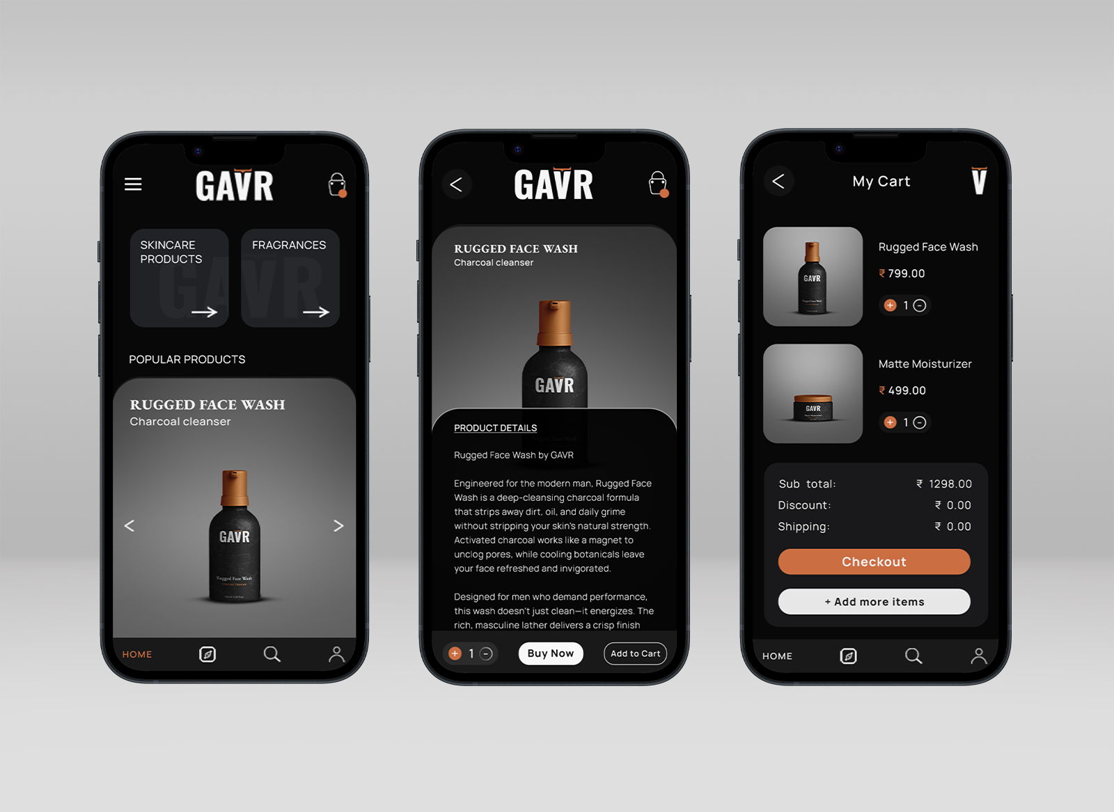
GAVR - Rugged Skincare Branding
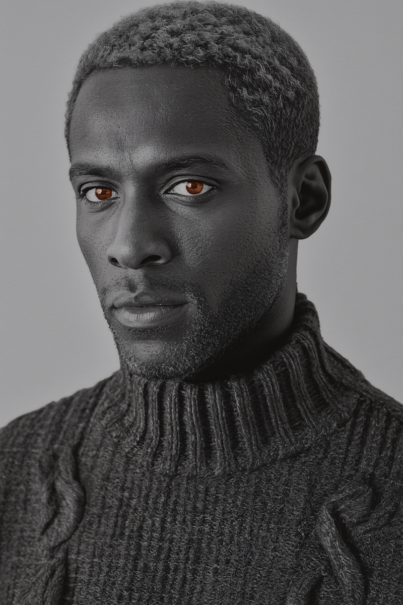
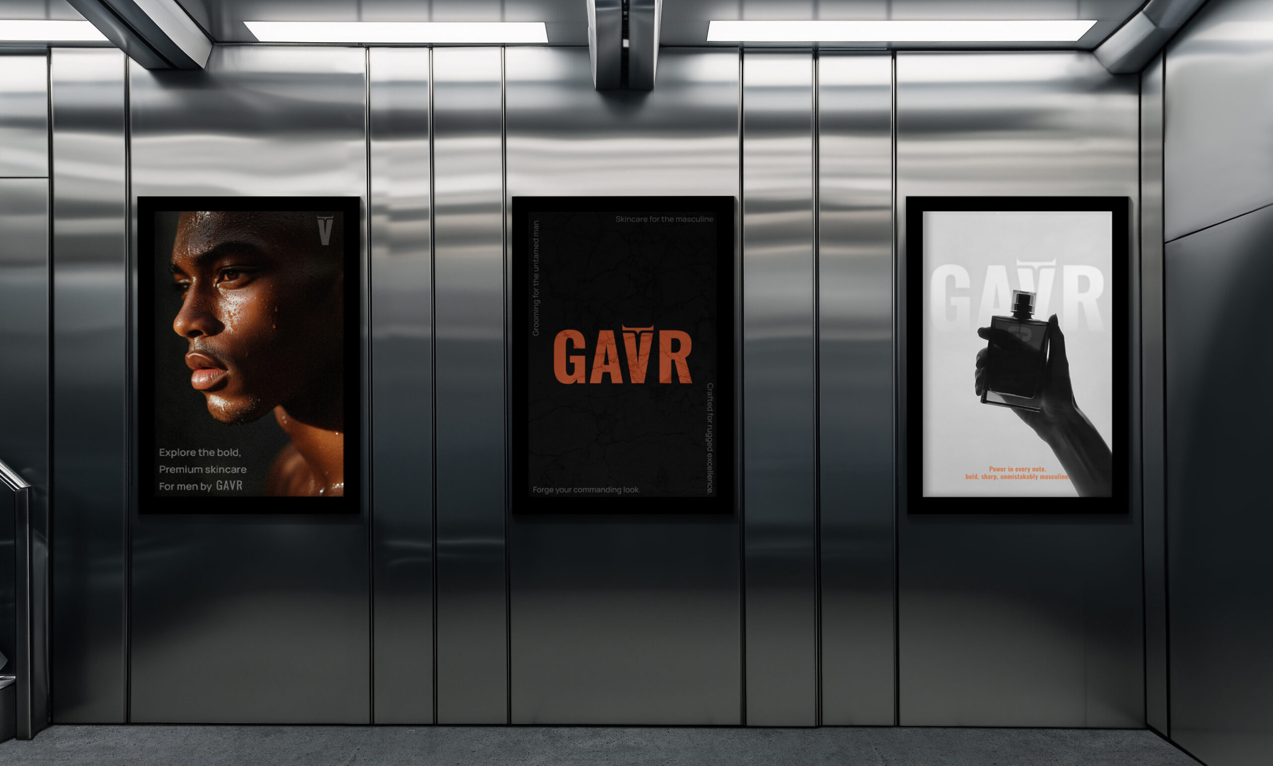
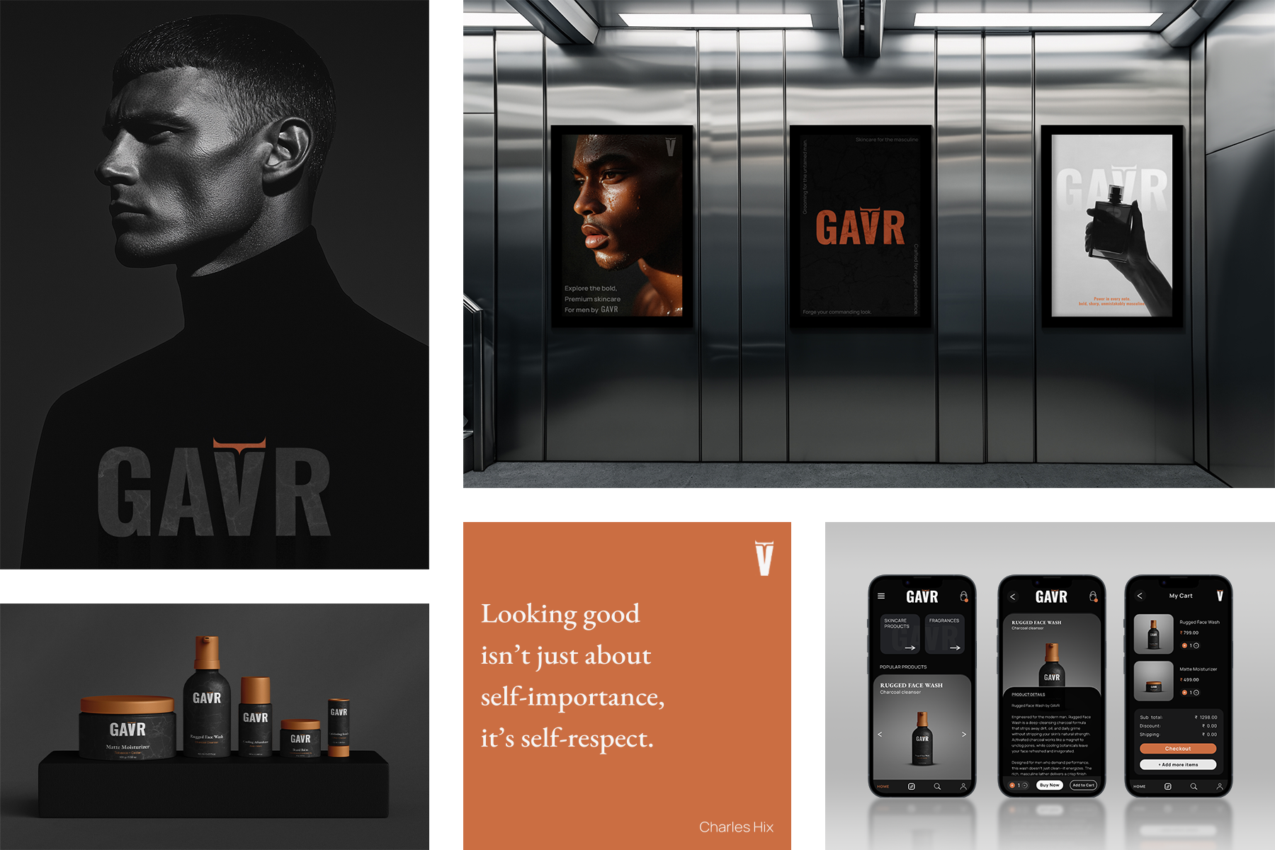
GAVR is a concept men’s skincare brand built around boldness, strength and simplicity. The name takes inspiration from the gaur, a powerful bull, and the logo reflects that with sharp horns integrated above the V. The target audience was men who want self-care stripped down to the essentials: functional, minimal, and unapologetically masculine. We leaned into a persona that values presence over polish, making the identity resonate with confidence and clarity.
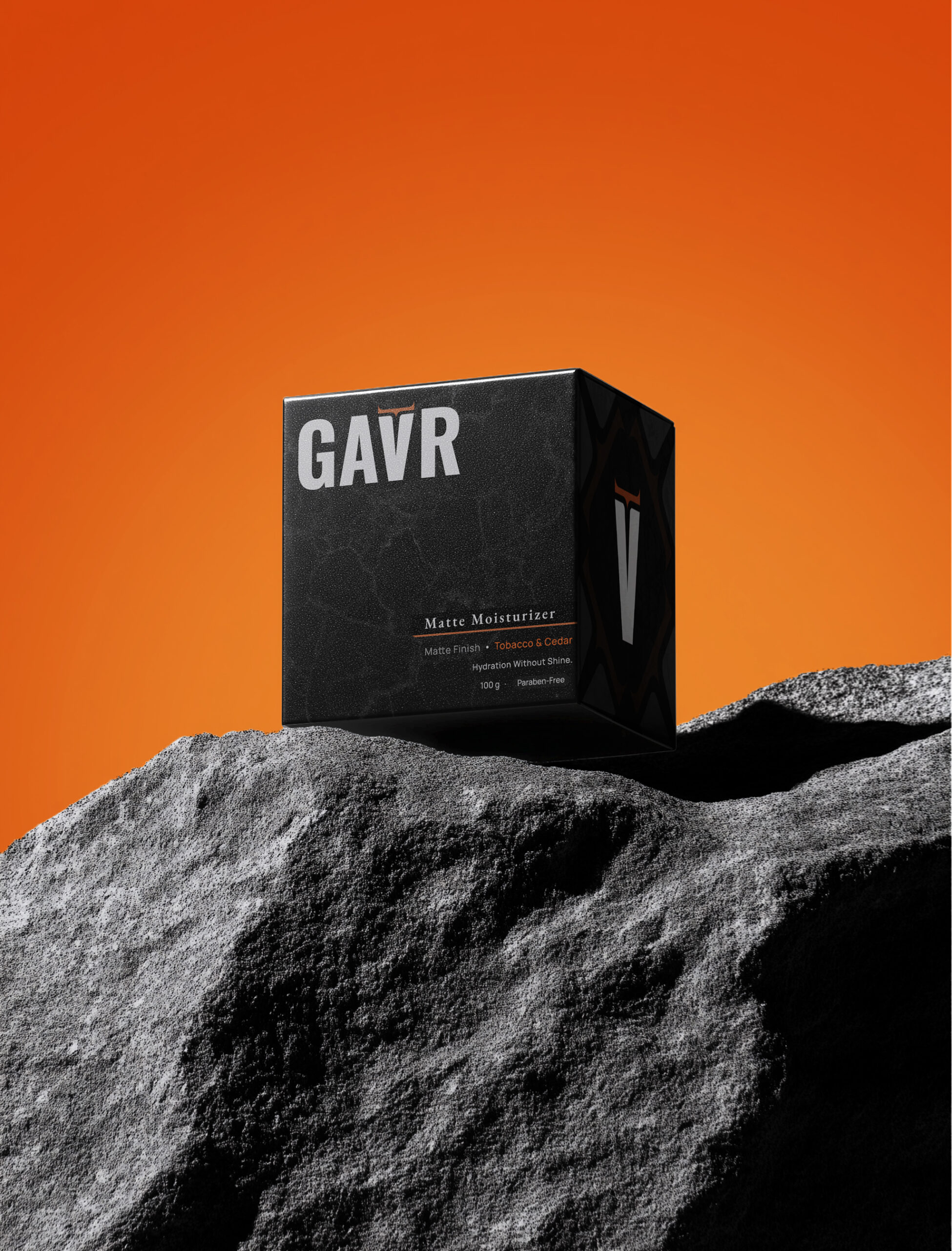
Our design direction focused on creating a rugged yet minimal look. A bold palette of Charcoal, bone and copper was paired with sharp typography and clean layouts. The result was branding that feels timeless, confident and direct, with packaging that stands out without unnecessary embellishment. Through symbolism, strong visual language and a clear understanding of the audience, we shaped GAVR into more than a skincare line — it became a persona.
About GAVR
GAVR was created for men who know that taking care of themselves is a sign of strength, not a weakness. Inspired by the powerful gaur, our brand cuts through the noise with a straightforward, no-bullshit approach to grooming. We believe a man can be both rugged and refined. Our essential skincare products are built for effectiveness, giving you the tools to maintain your edge and face any challenge. This is skincare, distilled.
Goals
Simplifying Skincare
We will build a focused and essential product line that addresses the core needs of men’s skin. We will eliminate complexity and confusion, making it easy for any man to adopt a healthy skincare routine.
Building an Authentic Community
We will connect with men who are confident, bold, and unapologetically themselves. GAVR will be more than a brand; it will be a standard for those who value authenticity and substance over trends.
Promoting Skincare as a Tool for Strength
We will shift the narrative from skincare as a luxury to skincare as a form of self-respect and preparation. Our products will be positioned as an essential part of a man’s daily gear, readying him for whatever life throws his way.
Delivering Uncompromised Quality
Every GAVR product will be formulated with powerful, no-nonsense ingredients. We are committed to creating highly effective products that deliver on their promise, ensuring our customers see and feel the difference.
Bold Typography
The strong, all-caps sans-serif font conveys power and confidence, fitting the brand’s rugged identity.
Subtle Symbolism
The horns above the “V” form a minimalist bull’s face, a nod to the gaur bull inspiration without being obvious.
Dual-Tone Palette
The black and white palette provides a clean, modern base, while the brass accent adds a touch of ruggedness
Adaptable Design
The logo works as a full wordmark or a standalone icon, ensuring its impact across all products and marketing materials.
PALETTE
CHARCOAL
#0C0C0C
BONE
#F5F5F5
COPPER
#CB6E42
OSWALD
ABCDEFGHIJKLMNOPQ R0123456789!@#$%
^&*
MANROPE
ABCDEFGHIJKLMNO PQR0123456789!@ #$%^&*
Typeface