ISLAND SHIP REPAIRERS
Rebranding And Visual Identity Design
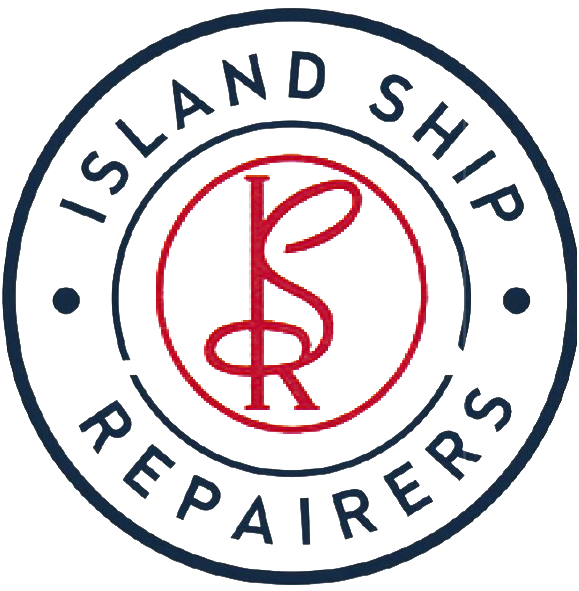
Island Ship Repairers (ISR) is a professional shipyard based in Port Blair with deep expertise in repairing, reconditioning, and overhauling a wide range of vessels. Despite their highly qualified workforce and advanced technology, the company lacked a consistent and recognizable brand identity. The old logo presented several key challenges. Visually, it was a stylized monogram of the letters ‘ISR’ contained within a simple circle. While it hinted at the company’s name, its design felt unclear. The thin, looped lines of the letterforms made it difficult to read at smaller sizes, and the overall design lacked the professional gravitas expected from a leading shipyard.
The most significant issue was the absence of a cohesive brand identity. The logo existed in a vacuum, with no consistent typography, color palette, or visual system to support it. This made it hard for the company to present a unified and recognizable brand image across different platforms, from signage to digital communications. The logo failed to meet this requirement, appearing more like a historical relic than a symbol of a modern, technologically-equipped company.
Our design solution was a strategic full-scale evolution. We focused on building upon the elements of the original logo to create a strong, modern, and memorable new logo system and visual brand identity.
Honoring the Monogram: We recognized the value of the intertwined ‘ISR’ monogram. Instead of starting from scratch, we redesigned the letterforms, giving them a more robust, professional, and legible structure. The new serif-like finishes add a sense of established authority, and the cleaner lines ensure the mark is sharp and readable at any size. This retains the core visual identity while making it infinitely more effective.
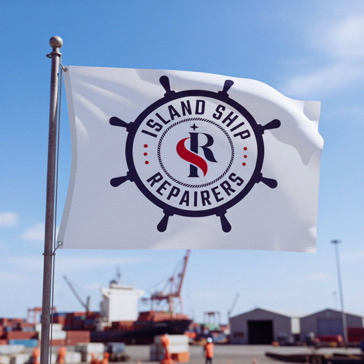
Building a Memorable Badge: The original circular badge was a good starting point. We transformed it into a powerful and symbolic brand mark by incorporating a ship’s helm, a universally recognized symbol of control, stability, and navigation. This not only elevates the design but also immediately communicates the company’s industry without being overly complex or “flamboyant.”
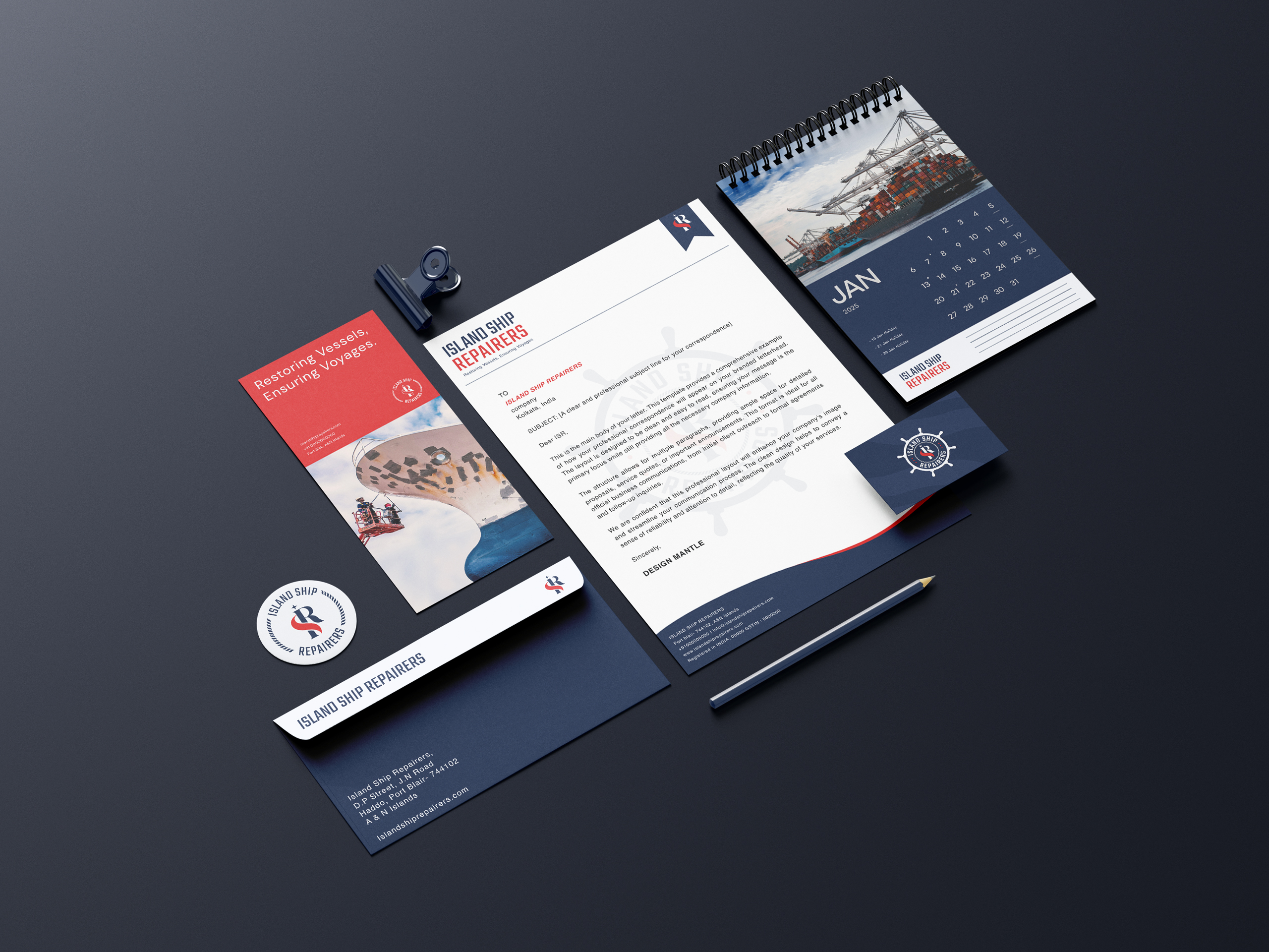
By focusing on these key improvements and creating a comprehensive new logo system, including a primary logo, secondary logo, wordmark, and monogram. We developed a visual brand that feels both new and familiar. It respects ISR’s past while confidently positioning them for the future through a complete and consistent visual identity.
Logo System
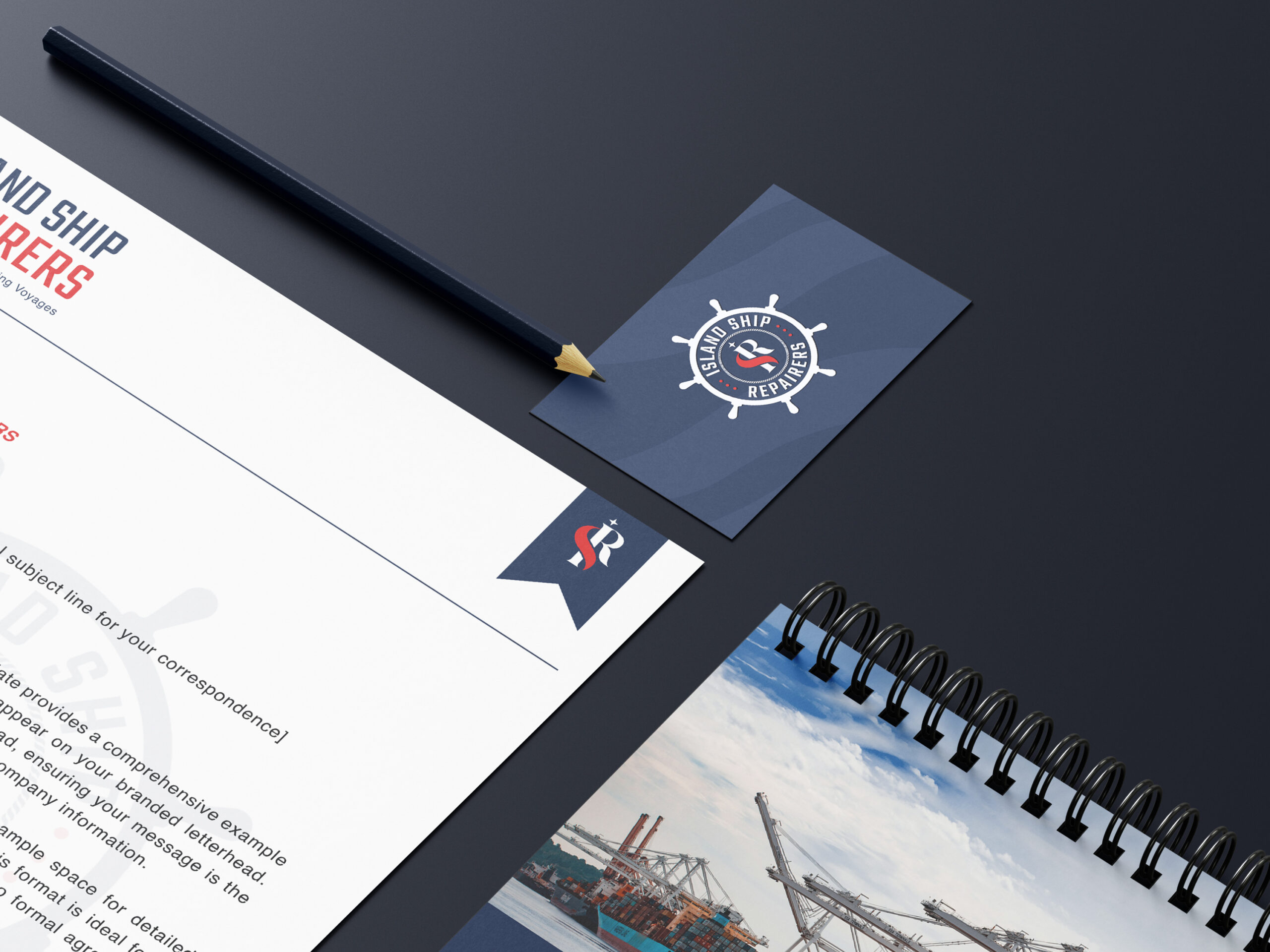
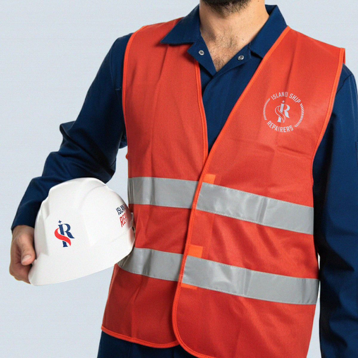
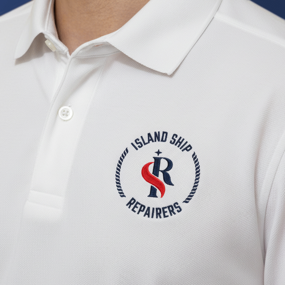
Primary logo
This is the full brand identity, designed for maximum impact and authority. It is the main logo used on all formal applications, such as the website, official documents, and large signage, to project a professional and established image.
Secondary logo
This is a simpler, more flexible version of the logo. It is used in smaller spaces and digital contexts, such as social media profiles, where the full primary logo would be too complex.
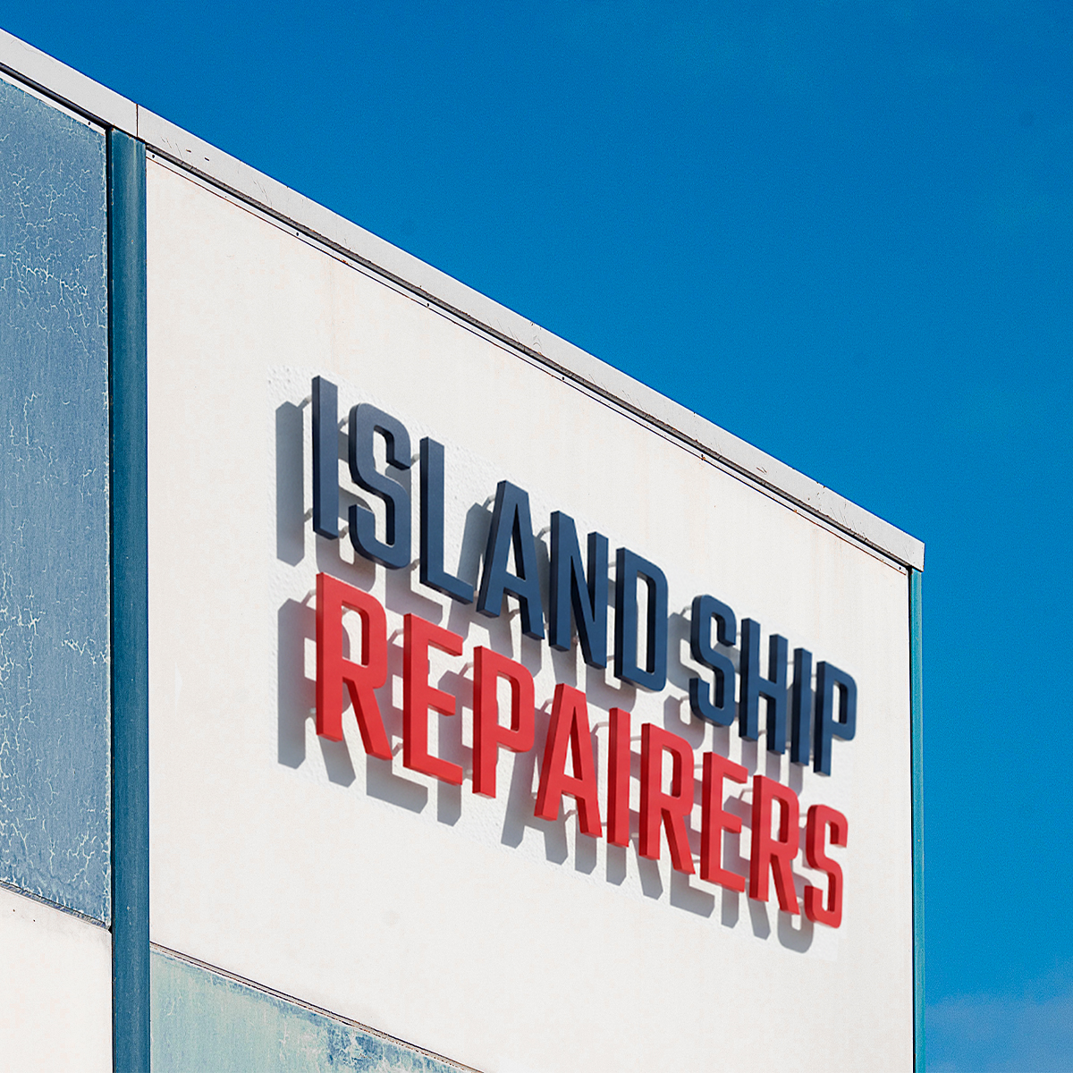
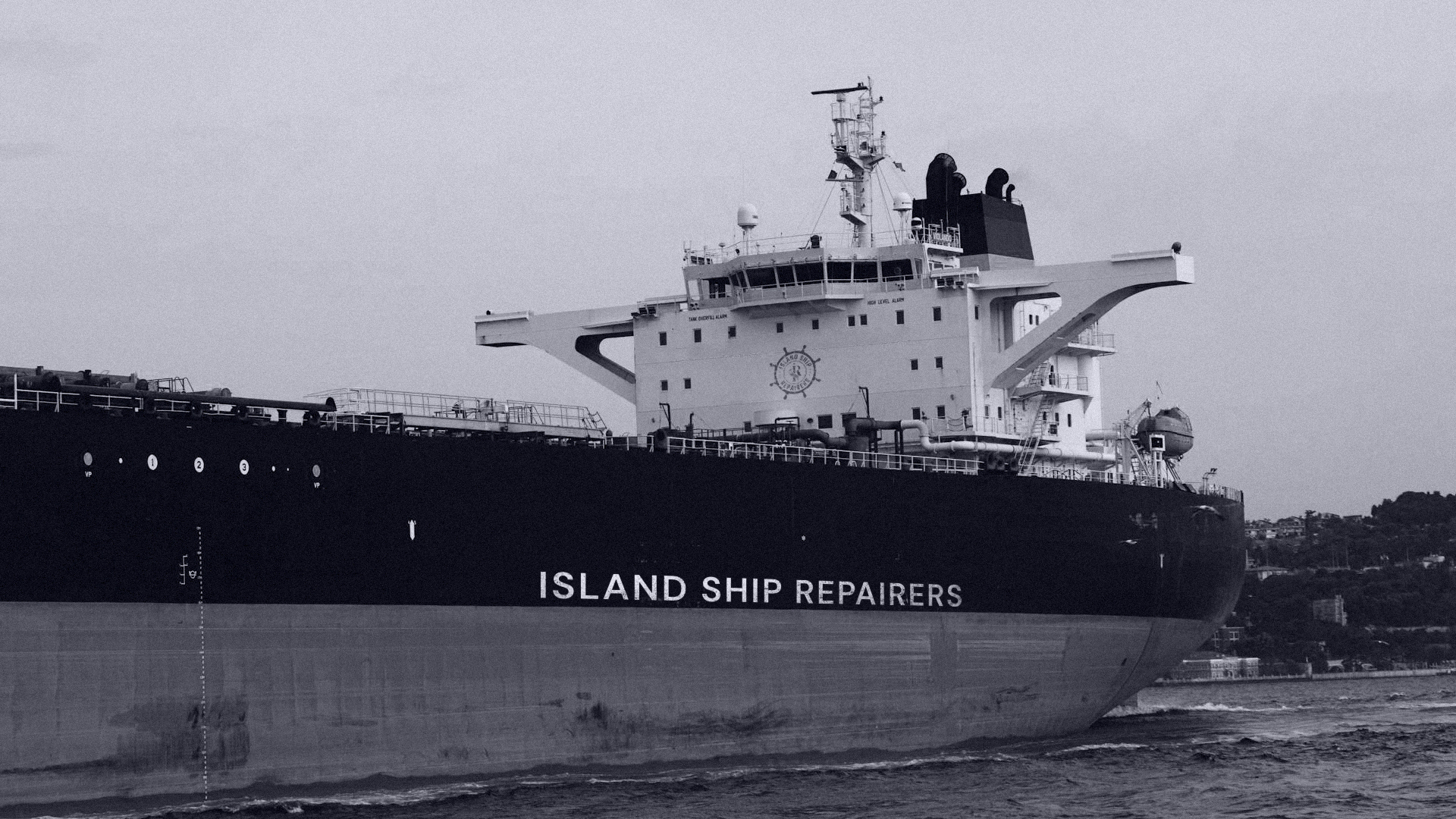
Wordmark

The wordmark focuses on pure legibility. It uses the brand’s typeface to clearly communicate the company name and highlight its core service, making it ideal for any instance where a clean, type-based logo is needed.
Monogram

This is the most versatile component of the logo system. The monogram serves as a quick, recognizable icon for very small applications like a favicon, uniform details, or watermarks.
Typeface
Teko
A B C D E F G H I J K L M N O P Q R S T U V W X Y Z 1 2 3 4 5 6 7 8 9 0 ! @ # $ % ^ & *
Roboto
A B C D E F G H I J K L M N O P Q R S T U V W X Y Z 1 2 3 4 5 6 7 8 9 0 ! @ # $ % ^ & *
Color Palette
CHARCOAL BLUE
(PRIMARY)
VIBRANT RED
(ACCENT)
STEEL GRAY
(NEUTRAL)
COOL WHITE
(NEUTRAL)