RIZZ ENERGY DRINK
Overview
The Brand : RIZZ—short for ‘charisma’, is an energy drink that echoes the art of enchantment. It’s for those who have the confidence to charm and the spirit to inspire. RIZZ stands as a tribute to effortless allure and the power of self-assurance, catering to trailblazers and innovators who lead with poise and grace. Every sip promises a burst of energy to fuel your inner spark, transforming everyday interactions into moments of impactful engagement. RIZZ isn’t just a drink; it’s liquid vigor for the go-getters and the dream chasers.
Our Role : The energy drink market is saturated with loud, aggressive branding, so the core challenge was to create a brand that was not only bold and full of energy but also sophisticated and confident. My role was to bring this unique ethos to life through a compelling visual identity. I was responsible for creating a distinct and memorable logo that embodied the brand’s core concept of charisma and energy. Furthermore, I developed the visual language for the packaging and label design, ensuring it was both eye-catching on the shelf and consistent with the brand’s premium feel. Finally, I translated this identity into digital marketing assets by designing promotional banners that would resonate with the target audience and drive engagement.
Logo
Icon
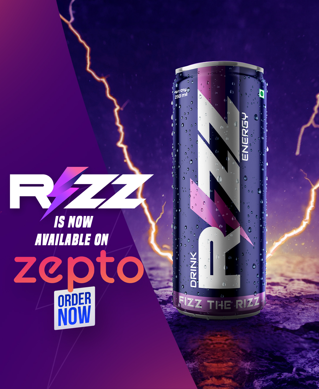
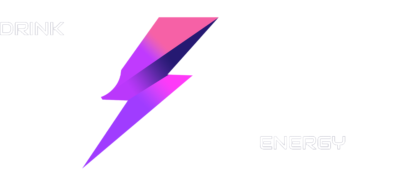
The RIZZ logo is a strategic solution designed for maximum impact and brand recognition. The custom wordmark is built with a bold, slanted typeface that conveys forward momentum and confidence. This strong foundation is balanced by the iconic lightning bolt, which replaces the ‘I.’
This isn’t a simple decorative element; it’s a dynamic symbol that represents the electric energy and ‘spark’ promised by the product. Its unique gradient, transitioning from purple to pink, gives the logo a modern, charismatic glow that sets it apart from the aggressive, one-dimensional branding of competitors.
The logo’s strength lies in its simplicity and versatility. The clean lines and clear composition ensure it remains highly legible, whether it’s a small social media icon or a large-scale banner. It effectively communicates both the brand’s name and its core promise of liquid vigor in a single, memorable mark. The result is a logo that is not only visually striking but also functionally perfect for a wide range of marketing applications.
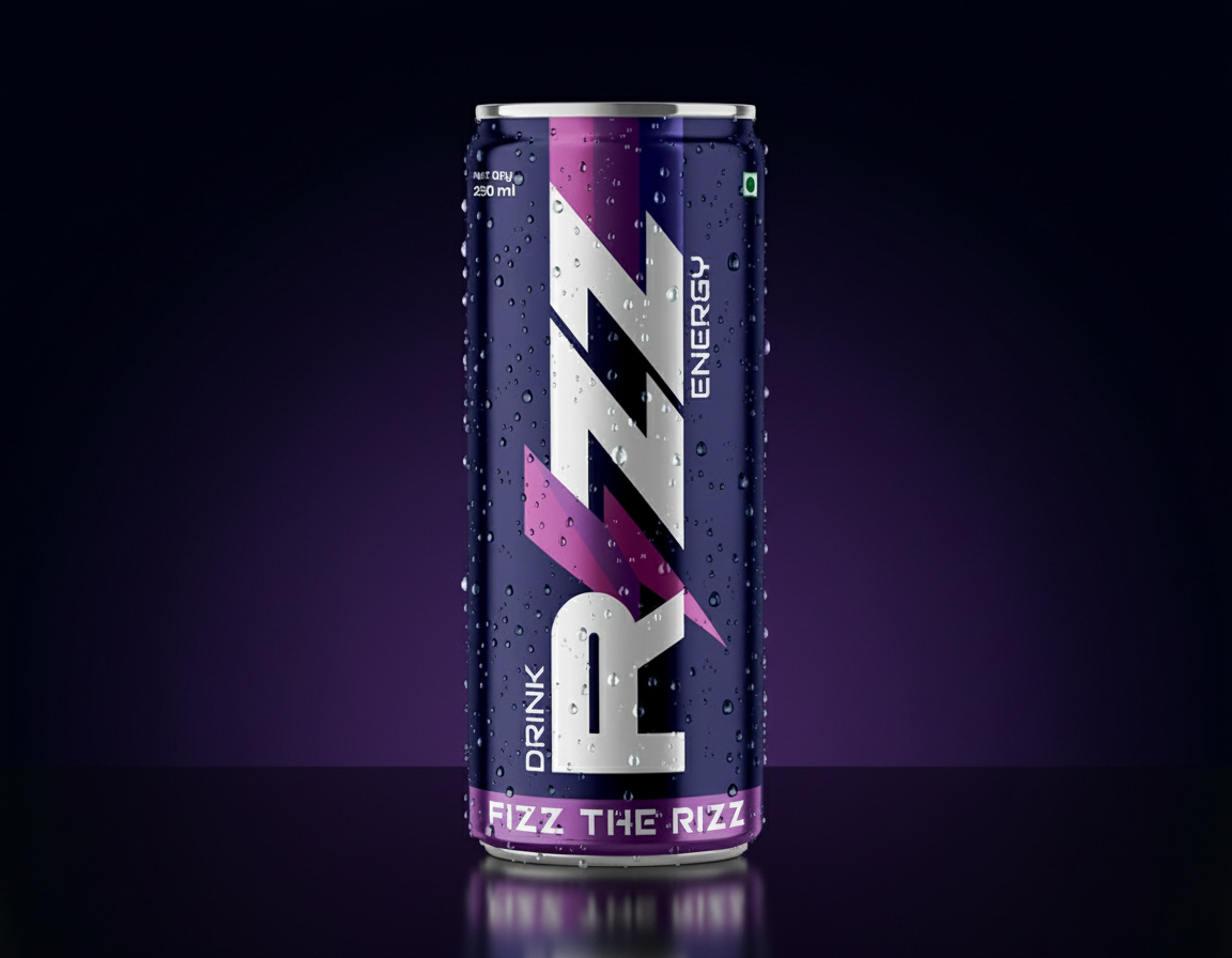
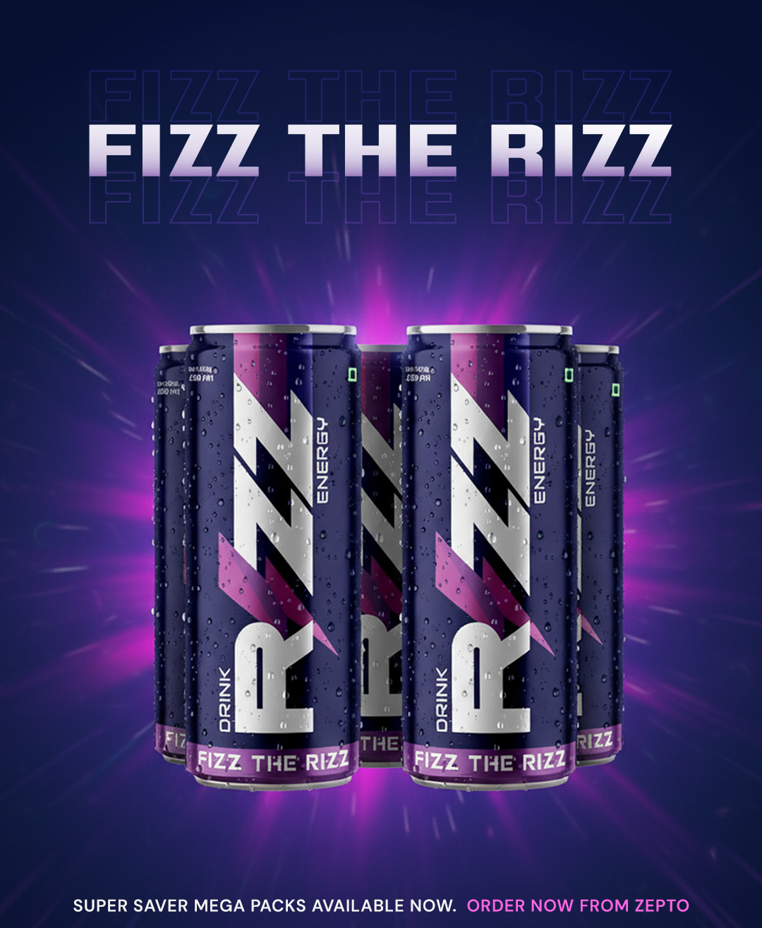
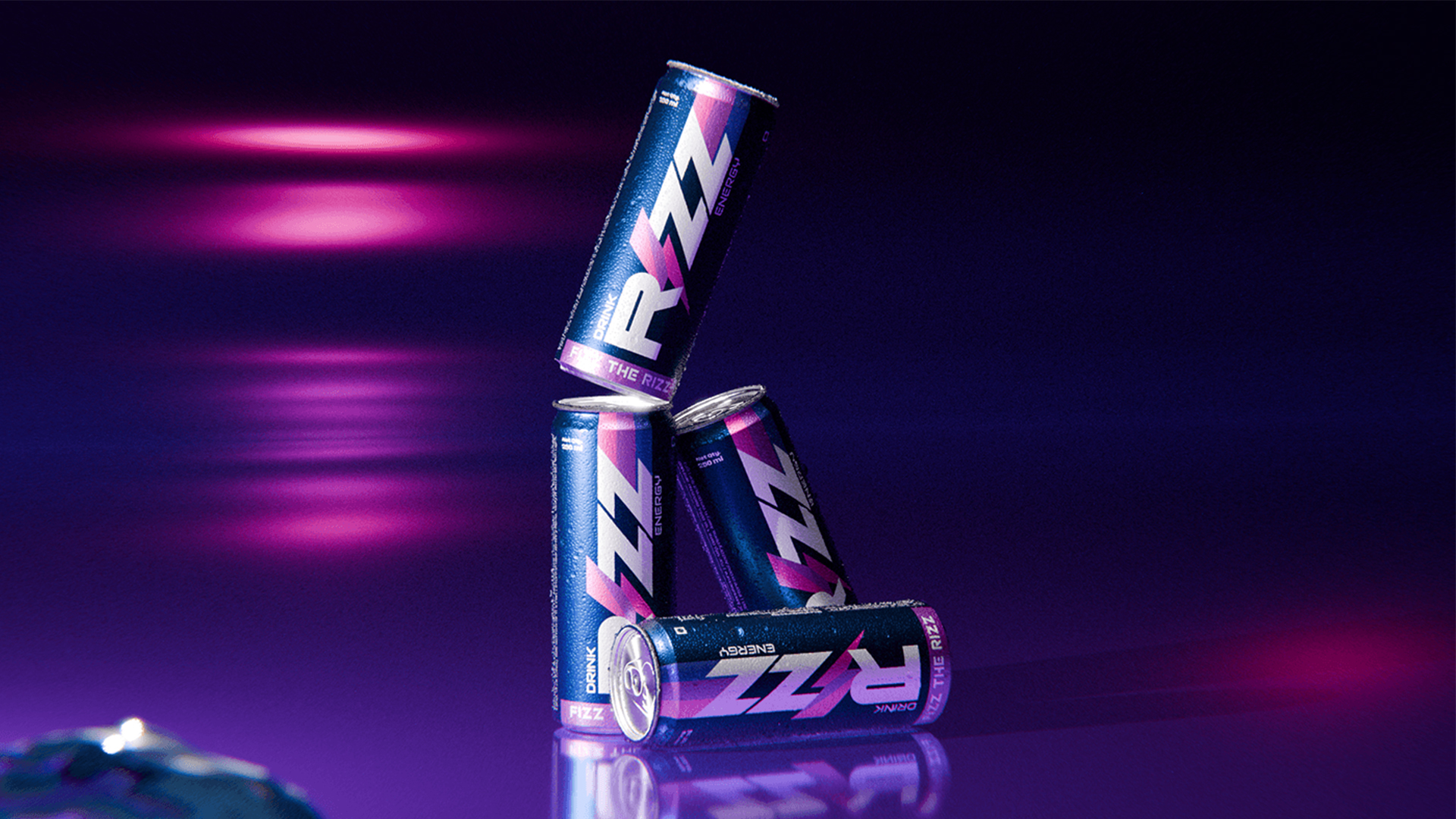
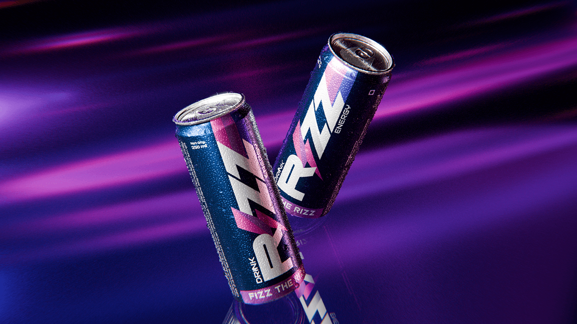
The RIZZ packaging design reflects the brand’s bold, charismatic identity and ensures the can stands out on the shelf. The vertical wordmark runs the full length of the can, breaking industry norms and creating a strong, dynamic presence. A deep matte navy finish sets a premium tone, while the glossy purple-to-pink lightning bolt delivers sharp contrast and energy.
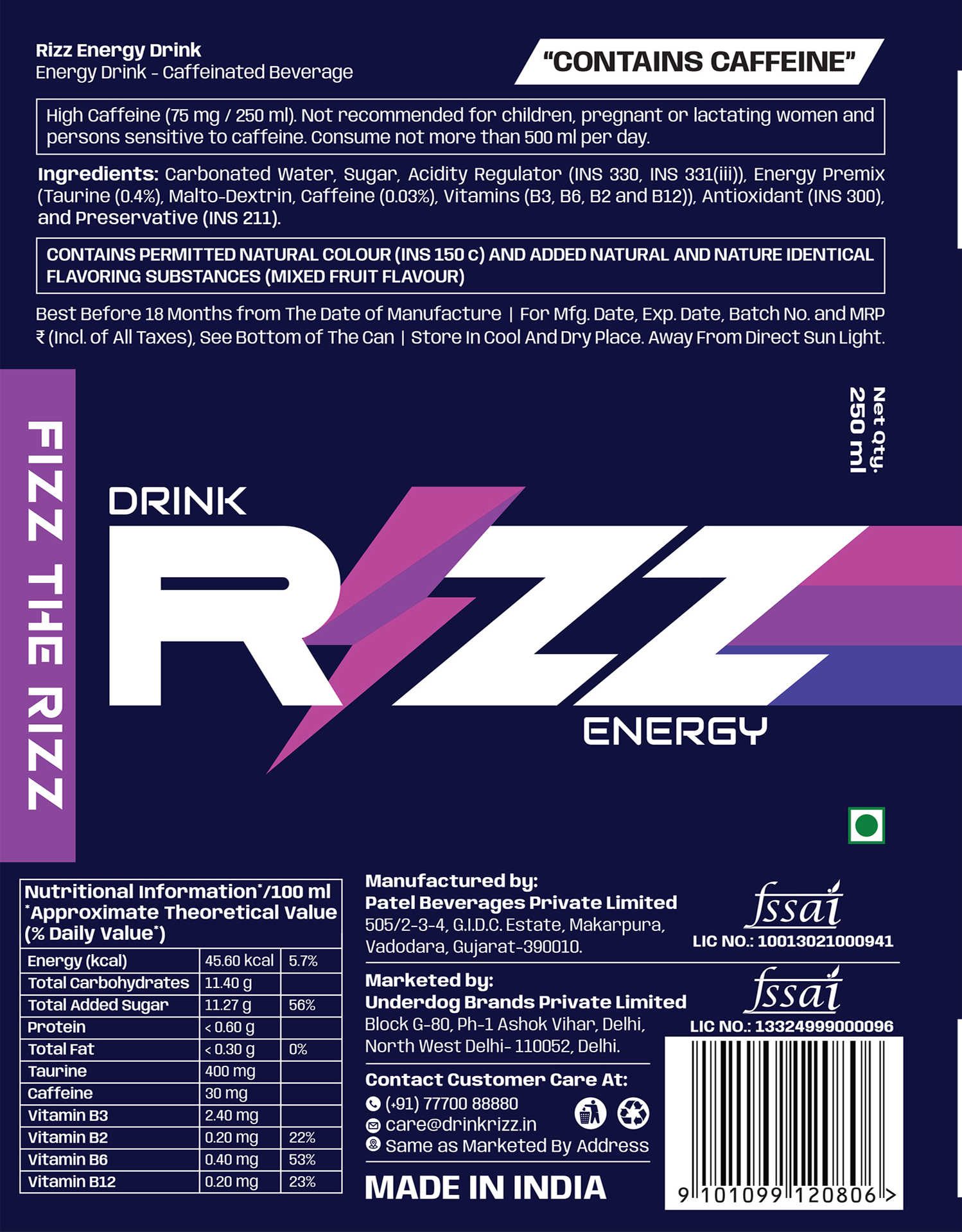
Typography strengthens the brand message. The angular RIZZ wordmark conveys power, while supporting text like “DRINK,” “ENERGY,” and the tagline “FIZZ THE RIZZ” use clean sans-serif fonts for clarity and balance. The full-wrap label follows a clear hierarchy, presenting nutritional and legal information in a precise, accessible way that supports both function and form.
Every element, from composition to textural contrast, works together to create a cohesive and memorable design that captures the sophistication and energy of the brand.
Promotional Content
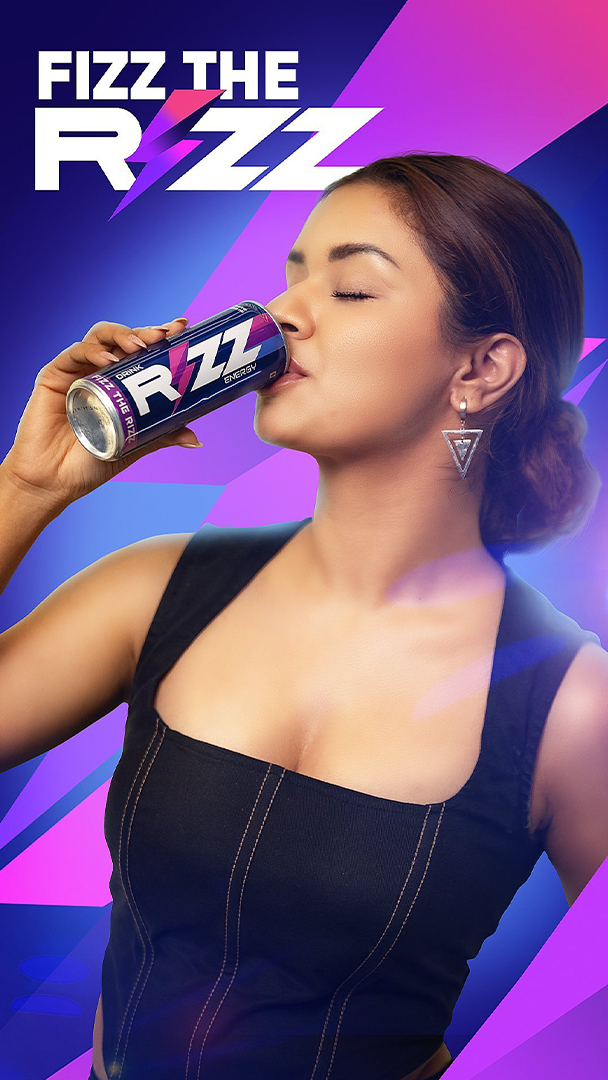
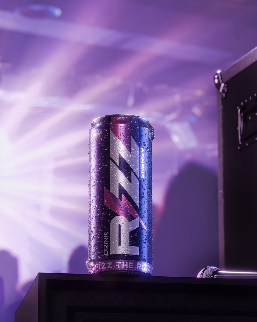
To amplify RIZZ’s presence, we extended the core visual identity, the bold wordmark and electric gradient, across all digital platforms, focusing on high engagement and consistency.
My work included designing on-brand digital posters that leveraged the logo’s dynamic typography and lightning bolt for instant recall. I adapted the visual language to seamlessly integrate celebrity endorsements, ensuring the brand’s charisma was amplified alongside the talent. Crucially, I produced high-fidelity 3D studio images of the can, enabling premium product showcases for both e-commerce and dynamic social media campaigns. Every asset was strategically designed to maintain visual consistency and elevate RIZZ as a sophisticated digital brand.